Current Recession Is Tracking the 1930s Bear Market
May
17, 2009 | about stocks: DIA / SPY
The following is a simple comparison of today's market
to that of the 1930s...no economic analysis here...
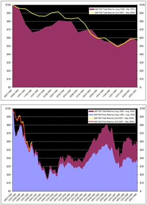
Today we’re 19 months from the S&P 500 peak in October
2007. How does the past 19 months compare to the 19 months after the S&P
500 peak in 1929?
The first graph below shows that today’s 19-month decline
from market peak is almost identical to the 19-month decline from market peak
after 1929 (down about 40% in both cases). Interestingly, the ‘recovery’ of the
last couple months is almost identical to the recovery during the first couple
months of 1931.
The second graph below extends the 1930s historical
comparison to include a full 10 years of data after the 1929 market peak. It
turns out the first 19 months of decline after 1929 was nothing.
Markets subsequently fell another 67% or so. Could this happen again today?
Also, in the second graph I included both total returns and
price returns for the S&P 500. Just a nice illustration
to show how the power of reinvested dividends helped investors recover some of
their money over time.
